Data Visualization
After taking a data wrangling course in R as a part of my graduate studies, I have begun experimenting with graphing publicly available data relevant to my research and to my interests.

Graphing Patuxent Research Refuge
Most weekends, you can find me at the South Tract of Patuxent Research Refuge, a wonderful park managed by the FWS, scouring tree trunks and fallen logs for insect life. I then post my photos to iNaturalist, a massive digital biodiversity database.
Given my love of this local park and my continual interest in improving my graphing skills in the programming language R, it made sense to download all observations of insects in the park and start graphing!

Graphing West Nile virus in Illinois and Beyond
My research focuses on the mosquitoes responsible for West Nile virus transmission in Chicago. I felt that my research presentations on the subject would be improved with representations of the burden of this disease on the city. I downloaded IDPH and CDC databases on viral cases by county and added the included graphs to my presentations.
Note: the legend on the bottom graph was removed as part of my presentation


Presented January 24th, 2024 at the 49th Annual Mid-Atlantic Mosquito Control Association meeting.
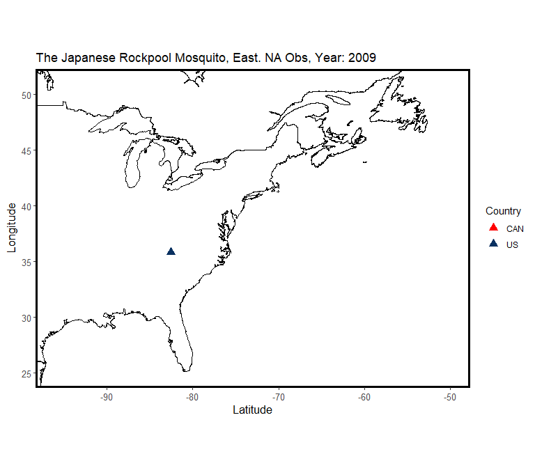
Graphing (and GIFing) the invasion of Aedes japonicus
As part of my data wrangling course, we were asked to create a self-contained R Markdown script of our choice. I chose to download iNaturalist data on the recent invasive Aedes japonicus and map observations of the species over time to see if I could detect any spread across the eastern United States!
This project challenged me to learn how to animate figures and expand my understanding of mapping geographical data